YouTube has been testing a new Desktop UI for quite a while now. They have experimented with it by putting the title, description, and comments on the right side of the video player. Video recommendations are now placed at the bottom of the video player.
This YouTube redesign is now available to all premium members of the platform. This experimental design is now available to its subscribers for now and maybe launched later this year for all users.
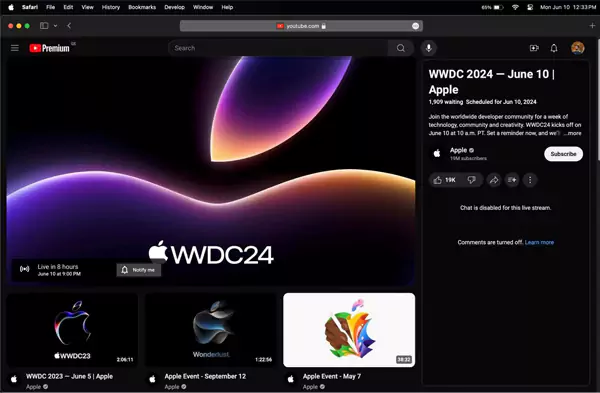
Here you can see from the above example provided by Android Authority that the title, description, and comments are shifted to the right side of the video player. Recommendations are at the bottom instead of the right side of the screen.
The company says that this design will improve the viewing experience for users. It is supposed to clear the playback screen, while also making it easier for users to find relevant content. This will also enhance the ability to engage with the comments.
However, the response to the new UI has been less than idealistic for YouTube. Yes, people are always less enthusiastic about change and they want to stick with what they are familiar with. However, users have noted that the new UI is less engaging, less responsive, and jarring in its presentation.
Since February this year, YouTube has been testing several variations of the UI but has settled for this one. Now, the company says that the redesigned watch page is now available as a premium perk till July 1st. That says a lot about the confidence the company has in this UI. It may suggest that they are planning to launch it soon for all users whether you like it or not.

Thanks for choosing to leave a comment. Please keep in mind that all comments are moderated according to our comment Policy.